
|
"There is no such thing as a red state or a blue state-- they are all purple states" (Howard Dean) "You
say you want a leader
|
|
| crayola nation : paint by votes ! A map is a popular graphic
device to communicate election results. Usually choropleth maps are
used to portray voting behavior. The problem with choropleth (or value-by-area)
maps to depict information related to people is that they visually emphasize
the land (e.g., an enumeration unit such as a state), and not the people
living on the land (i.e., the voters). |
|
 |
A typical election map example is the map on the left from CBS' Web site which was made by ESRI the 'GIS software leader', but hopefully not by a cartographer. The fact that ESRI headquarters are located in REDlands (CA) can only be a coincidence... ? This choropleth map stands for all the similar ones that were shown on TV stations during election night, Tuesday, Nov. 2 2004. Unfortunately, mapping totals or absolute values per enumeration unit (e.g., electoral or individual votes by state) is unacceptable by sound cartographic standards, if the goal is to show thematically relevant information in a perceptually salient manner. The enumeration units (e.g. states) are unequal in area, thus might give the reader a false impression of the mapped data distribution. A person not familiar with the U.S. voting system might wrongly assume that President. George W. Bush is winning the election hands down, considering that two thirds of the U.S. is shaded in red. However, the race is much closer. Bush did win 28 of the 51 states (at the time of writing), but only 254 of the electoral votes (58,601,943 votes, or 51,08% of the popular vote). Senator John Kerry on the other hand scored only in 20 states, but still received 252 of the crucial electoral votes (55,071,989, or 48% of the popular vote, election data from the New York Times).
|
| presidential election results (© by CBS, map by ESRI) | |
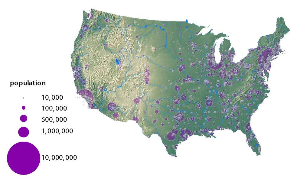
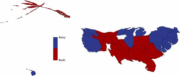
| The map below (left) of the largest cities in the U.S. depicts the uneven distribution of people across the nation. It may explain the cartogram shape on the right, where the thematically relevant information (i.e., the magnitude of people within the zone) are made perceptually salient. | The two-variable contiguous area cartogram below depicts enumeration units proportionally scaled to the data that they represent, namely electoral votes. The more electoral votes in a state, the larger the area of the state. The states are shaded with the color of the candidate winning the electoral votes. |
 |
 |
| populated areas in the U.S. (© by sara i fabrikant) |
red and blue america (© by sara i fabrikant) |
| The two-variable contiguous area cartograms below also depicts enumeration units proportionally scaled to the data that they represent (e.g., electoral votes). The more electoral votes in a state, the larger the state. In addition, traditional choropleth shading is applied, showing the proportion of people voting for a candidate. |
Input data for a cartogram is never classified. The cartogram is therefore one of the truest form of quantitative mapping. This is why a cartogram legend should include a continuous tone color bar, showing a continuous data range from minimum to maximum value (not labeled). |
 |
|
| the Kerry blues (© by sara i fabrikant) | shades of red -Bush (© by sara i fabrikant) |
| Kerry paints strongest in Blue in the White house zone (D.C.: 89.7%), while Bush's darkest Red is in Red rock area (Utah: 70%). | The vast Rockies, the rural Plains and the deep South are RED-land in crayola nation. The 'BLUES' have settled in the highly urbanized, populous states, at the 'edges' of Red/Blue America. |
 |
Due to popular demand, finally a cartogram on county level data. The counties are scaled by population (2000). The shading is the percentage of the popular vote for President Bush. The overall pattern (e.g., shape distortion of the U.S.) is similar as in the state-level cartogram. However, data at a finer spatial scale allows to see a more nuanced picture of the election results. Populous counties containing large cities (e.g., New York, Chicago, Los Angeles, San Francisco, etc.) are typically blue, even though they may lie deep in red state land (e.g.., St. Louis, Denver, Minneapolis, Miami, Palm Beach, etc.). |
| county-level cartogram (© by sara i fabrikant) | |
| ...
and what the colors might mean (according to the
Washington Post, 2004): |
|
| most likely to be found among highly educated women, non-churchgoers, union members and the “cosmopolitans” of the New York area, New England and California. |
older, more likely to be married, less likely to join a union, more likely to be regular churchgoers—mostly at Protestant churches—far more likely to be “born again” Christians... |
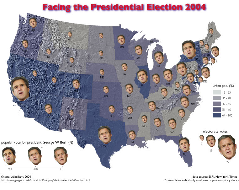 |
Another
problem with the ubiquitous blue/red choropleth map is that only one
piece of information is shown, namely, who won which state. *the resemblance of the about 55% digitally morphed face between Kerry and Bush (e.g., face in California) with this man is striking! |
| Chernoff
revisited: facing the presidential election
(© by sara
i fabrikant) |
Read more on the theme in an article by the © Santa Barbara News Press |
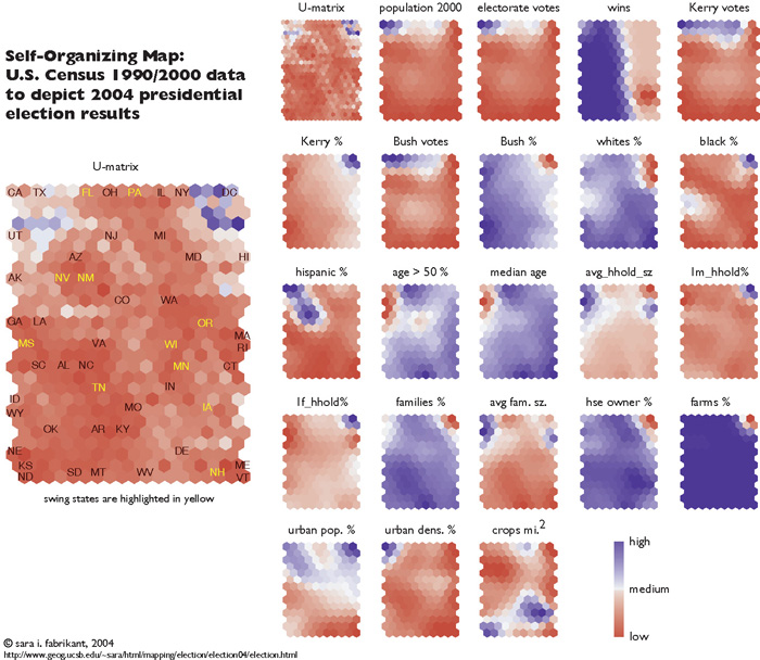 |
The cartogram distorts geographical space to depict the data relationships in the attribute space more saliently. One can go even a step further, and use the map as a spatial metaphor entirely, for example to depict relationships in attribute space without the geography. The Self-Organizing Map (SOM) on the left is an example. A SOM (in essence a neural net) re-arranges a state's location in a hexagonal grid space according to its socio-demographic similarity with other states. States that resemble each other socio-demographically are placed closer to one another in the SOM than less similar states. States at the edges of the map are socio-demographically more different to other states than states towards the center of the map. Twenty two census variables were used to compute the SOM. The distribution of high and low values for each variable across the SOM map can also be depicted by a map. Click on the graphic to see a larger version image. |
| SOMe election! (© by sara i fabrikant) | |
 |
Additional multivariate statistical techniques can be applied to the attribute data and depicted in a SOM for further exploration. The upper graphic in the image on the left depicts three state clusters identified by a K-means clustering algorithm on the selected socio-demographic attribute data (see above SOM). This means that U.S. states cluster socio-demographically into 3 distinct groups. One can visualize these three statistical groups in geographic space, and explore the resulting pattern in a traditional map. The contiguous red cluster in SOM space is also contiguous in geographic space, shown in the map on the left. This pattern provides support to the the well-known first law of geography that states "everything is related to everything else, but closer things are more related than distant things" (Tobler, 1970). Interestingly, the swing states (highlighted in magenta) seem to form a contiguous "buffer zone" in the North East, between blue and red land. Click on the graphic to see a larger version image. |
| socio-demographic regions (© by sara i fabrikant) | |
Curious to explore more of the fascinating world of cartograms? Click here
for a hands-on example powered by Adrian
Herzog's cartogram applet (not functional anymore) MApresso.
More on election maps...
This page is up since Nov.
3, 2004, © by sara irina
fabrikant, 2004 (not maintained any more, see redirect:
http://www.geo.uzh.ch/~sara/maps/election/election04/election.htmlmapping/election/election04/election.html
