All maps are distortions
of reality, said Mr. Montello, who studies how people perceive space and
geography. The earth is round and land masses are difficult to accurately
draw on a two-dimensional plane. But different maps serve different purposes.
For Mr. Montello, who has
a doctorate in psychology and serves as the chairman of the university's
Cognitive Science Program, the meaning a map conveys is important.
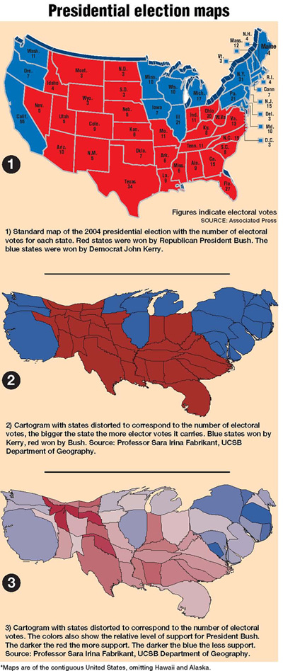
The red of giant western
states like Wyoming, with its population of less than 500,000, dominates
the electoral map used by most newspapers.
But try and find the blue
dot of the District of Columbia, which has close to 600,000 people. There
are more people in a few blocks of New York City than the whole state
of North Dakota, but you would probably have an easier time finding Bismarck
than the Bronx in most of the national maps used to chart the election.
There are some notable exceptions
to that rule. Both the New York Times and the Los Angeles Times this week
have included different maps to chart such things as the depth of support
for each candidate in each county across the nation. And both papers have
included maps that distort the shape of states, enlarging and shrinking
them based on their electoral votes.
It is ironic that distorted
maps can actually convey more meaning than the standard representations
of the United States, said Sara Fabrikant, a geography professor at UCSB.
Ms. Fabrikant created her
first election map the day after the 2000 presidential election. The Swiss
native wanted to understand the close race. She was perplexed by the message
that the election was too close to call, yet the election maps used on
television and in the newspapers showed a nation colored mostly Republican
red.
"I'm not an American citizen
and I didn't understand the electoral vote system until I put it on a
map," she said.
The traditional political
map made it appear that President Bush was winning hands down.
"In essence they are using
the wrong visual form," Ms. Fabrikant said.
Using cartograms, maps that
include statistical data to add color shading or distortions in shape,
she created a map based on electoral votes that showed a more even split
in votes between candidate Al Gore and Mr. Bush in the 2000 race.
She did it again this year,
posting her maps online the day after the race.
The distorted maps range
in color from a light blue to light pink, showing both the intensity of
support for each candidate and the relative number of votes each got.
(One of her colleagues said the distorted national map looks slightly
like an upsidedown donkey, but Ms. Fabrikant said it was pure coincidence
and that she has no party affiliation.)
"What you can really see
is the urban and rural contrast in voting," Ms. Fabrikant said.
The cartogram contracts the
empty land and expands the populated cities.
Over the summer she delivered
a paper on the 2000 race, "Blue & Red America," to a group of German academics.
She's also added other variables to her maps and included a breakdown
by county. What's striking is that displaying the data in different ways
begs new questions. On one map she included major rivers and highways
and found a line of blue snaking up the Mississippi. In another she saw
an arching band of blue extending through several southern states.
The apparent patterns prompted
her to wonder if the lines followed the same migration routes of blacks
who moved north for jobs, or whether they simply follow urban development
along the river front. Ms. Fabrikant said she would like to work more
with a political scientist to investigate those patterns.
Making these maps isn't about
politics, she said, but communicating information.
"Basically what has been
driving cartography for 5,000 years is the acknowledgement that a picture
really is worth a thousand words."
FYI
Sara Fabrikant's election
maps and information about cartograms can be found at her Web site:
www.geog.ucsb.edu/~sara/
|