cartographic
variations
on the presidential
election 2000 theme
|
"The American
people have now spoken, but it's going to take a little while to determine
exactly what they said."
- former President Bill Clinton.
"Celebrating America's Spirit Together"
Theme of the 54th inauguration - new President George W Bush.
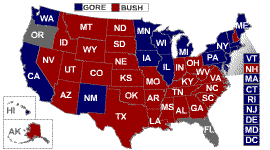
A map is a popular graphic device
to communicate election results. Usually choropleth maps are used to portray
voting behavior. Typical examples are the maps below from CNN's and NBC's
Web site, or the ones that were shown on all TV stations during election night
(Tuesday Nov.7 2000). Unfortunately, mapping totals or absolute values per
enumeration unit (e.g. electoral or individual votes by state) is unacceptable
by sound cartographic standards. The enumeration units (e.g. states) are unequal
in area, thus might give the reader a false impression of the mapped data
distribution. A person not familiar with the US voting system might
wrongly assume that Gov. G.W. Bush is winning the election, considering that
two thirds of the US is shaded in red. Indeed, Bush won 29 of the 51 states
(at the time of writing), but only 246 of the electoral votes (48,783,510
votes). Gore on the other hand scored only in 20 states, but received 260
of the crucial electoral votes instead (48,976,148 votes).
|

|
| traditional
choropleth map(© by CNN) |
another
traditional choropleth map (© by NBC) |
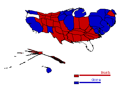 |
The two-variable
contiguous area cartogram on the left depicts enumeration units proportionally
scaled to the data that they represent. In addition, traditional
choropleth shading is applied, showing the States won by each candidate.
The size of each state is transformed based on the magnitude of electoral
votes, emphasizing the variable that carries the crucial election
information. The size of the red areas has decreased dramatically.
The length of the bars in the legend refers to the amount of observations
falling in each category (# of won states per candidate).
Input data for a cartogram is never classified. The cartogram is therefore
one of the truest form of quantitative mapping. This is why a cartogram
legend should include a continuous tone color bar, showing a continuous
data range from minimum to maximum value (not labeled). The overlay
with a categorical variable map (Gore, Bush, or undecided wins) would
typically require a qualitative color scheme, showing differences
in kind. For example a discrete, classed legend type, with three distinct
color hues for each case, e.g. blue, red and white. |
contiguous
cartogram based on electorate votes
(© by sara
i fabrikant) |
 |
In this value-by-area
map, the size of each enumeration unit is scaled based on the magnitude
of total population within each State (1997 data). Again, the
size of the red areas has decreased dramatically. Overall, the
two cartograms look very similar, still slight variations are distinguishable.
This is not surprising, as the amount of electoral votes is based
on the magnitude of inhabitants in each State. The length of the bars
in the legend refers to amount of observations falling in each category
(# of won states per candidate). |
contiguous
cartogram based on total population
(© by sara
i fabrikant) |
|
 |
This cartogram
shows an entirely different picture of the presidential election.
The states are scaled according to population density (1997 data).
East Coast States clearly dominate the scene, with the District of
Columbia (D.C.) leading the pack.
As Karen S. Eisenhart from Boulder, CO notes: "This is interesting
in light of the fact that the District of Columbia has no representation
in Congress. Recently, they have proposed to change the slogan on
their license plates to taxation without representation."
|
contiguous
cartogram based on population density
(© by sara
i fabrikant) |
|
Data Source: ESRI ArcView 3.2 data
CD: shapefiles and US population data attributes 1990/1997.
Curious to explore more of the fascinating world of cartograms? Click here
for a hands-on example provided by Adrian
Herzog's cartogram applet MApresso.
Also check out this contiguous cartgram
animation. A non-contiguous cartogram
animation is provided by Keith Clarke. More on election
maps...
© by sara
irina fabrikant, 2000
(not maintained any more, see redirect: http://www.geo.uzh.ch/~sara/maps/election/map.html